4473
4473
Need some simple fixes to improve accessibility? The Office of Digital Learning has a collection of tips for making course content more accessible. See the full collection:
This tip focuses on color contrast. Making sure your documents follow guidelines for optimum contrast is helpful for all students, but especially for those with visual impairments like color blindness. Good contrast makes content easier to view when it’s projected in class or on low-quality monitors. It also makes viewing content easier on a mobile device any time there’s a glare on the screen.
How to Fix Contrast Issues
The easiest way to fix contrast issues is to open your Ally Course Report, scan the list of accessibility issues, and locate content flagged with “The document has contrast issues,” “The image has contrast issues,” or “The HTML content has contrast issues.”

Once you click on the content affected, Ally lists files that need attention.

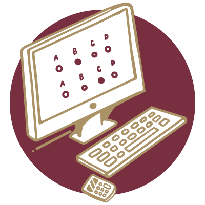
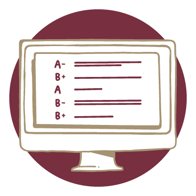
Click on a file for step-by-step instructions to improve contrast. In the example Microsoft Word document below, Ally flagged eight text fragments with insufficient contrast. Select How to fix contrast and then choose the version of Word you’re using.

Ally provides instructions that are customized to the version of Word you selected. Follow the instructions to open the original file, fix the contrast issues, and then upload a revised file.
Once you’ve addressed contrast in a Microsoft Word file, you’ll find that the steps for fixing contrast in other Microsoft files are similar.

Tips for Good Contrast
You can improve the readability of content in your course material by following a few best practices:
Choosing Fonts
- Choose fonts with wide character strokes.
- Choose a font size of 12 pixels or larger (16 pixels if you’re using a font that has thin character strokes).
Choosing Colors
- Use light text on dark backgrounds.
- Use dark text on light backgrounds.
- Avoid color combinations like these:
- Green and red
- Green and brown
- Blue and purple
- Green and blue
- Light green and yellow
- Blue and gray
- Green and gray
Additional Resources
For more information and tools to help you with color contrast, we recommend the following:
- WebAIM’s Contrast and Color Accessibility article provides a well-organized, easy-to-read introduction to this very important aspect of accessibility.
- TPGi’s Colour Contrast Analyser is a helpful tool for checking your content’s color contrast.
- If you’re comfortable working with Design PLUS in Canvas, it will help you check the color contrast on Canvas pages.
New to Ally?
The Office of Digital Learning enabled the course accessibility tool Ally in all Canvas courses and organizational sites. Ally simplifies the process of converting course materials into formats all students can access. Visit the Ally Resource Guide for access to Ally support resources, including webinars and one-on-one consultations.
Please don’t hesitate to contact us if you have questions.
Questions? Visit us on the web at odl.fsu.edu, sign up for our newsletter, call 850-644-8004 Monday-Friday 8am-5pm, or submit a ticket to ODL Technical Support.