6110
6110
Ally's University Reports can help you to get a big-picture view of how accessible your college's, school's, or department's course content is. Then, you can drill down into the specifics to see exactly what types of content are getting good accessibility scores and what types of content are scoring poorly and may need more attention.
Note: Ally's University Reports are accessible to Canvas sub-account administrators and Accessibility administrators. If you are a sub-account administrator or accessibility administrator, you will only be able to see the University Report for your own college, school, or department, depending on your Canvas sub-account level of access. You will not be able to see information for other colleges, schools, or departments that fall outside of your Canvas sub-account. if you do not have access to the Canvas Admin option and are unable to follow the steps below, then you do not have a sub-account administrator role in Canvas.
How to access the University Report for your college
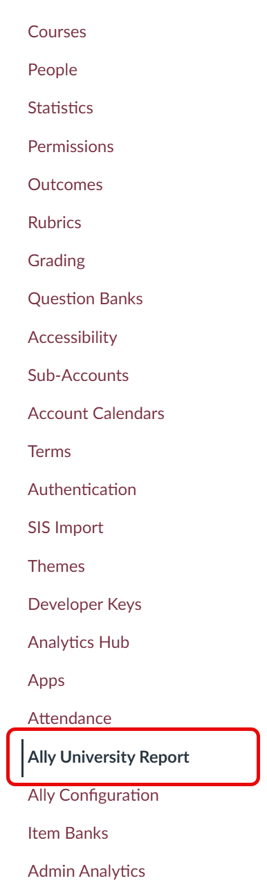
- Login to FSU's Canvas.
-
On the global navigation menu, select Admin and then click
on the name of the Canvas sub-account that you manage in the menu that
appears.

-
Select Ally University Report from the links listed on the
left-hand side of your admin page.
The Ally Overview dashboard is the landing page for your sub-account's University Report.
Using the Ally University Report for your college
The University Report is split into four tabs: Overview, Courses, Directory (if your college contains sub-branches in our Canvas system), and Usage. From all of these tabs, you can export your college's Ally data to a .csv file.
Note: The screenshots below do not contain real data and are provided for illustrative purposes only.
Overview Tab
The Overview dashboard displays a few different graphical presentations of how your college's course content is performing in terms of accessibility.
Dynamic Graph: Accessibility Score
The accessibility score graph displays three different scores: Files score, WYSIWYG score ("What You See Is What You Get" - this means anything manually typed into or created in Canvas, like a discussion board prompt or a Canvas page), and an Overall score. See our Content Ally checks in University Reports article for more specific ;information on what file types and Canvas content contribute to these University Report accessibility metrics.
The accessibility score graph is a dynamic dashboard that you can use to easily filter down to the information that you are looking for. You can toggle the time period filter on the right to view the accessibility score graph by academic year, term, or month. You can also export your college's data to a .csv file if desired by pressing the Export button in the upper right corner. Clicking directly on the graph filters the rest of the data on the page below it, allowing you to easily drill down to more detailed information.

For more information on how to use the Accessibility Score graph, see Ally's Accessibility score resource.
Circle Graphs: Total Courses, Total Content Created, and Overall Accessibility Score
Below the Accessibility Score graph are three data representations: Total courses, Total content created, and Overall Accessibility score. If you hover over any part of these you will see more information. The percentages at the bottom of these graphs compare the change in these metrics from the previous time period.

For more information on how to use these graphs, see Ally's Total courses and content created resource and Overall accessibility score resource.
Accessibility Issues Dashboard
The Accessibility Issues Dashboard offers a list of detailed information about what specific content issues are getting flagged as inaccessible for this time period and how many course content items are failing these specific checks. You can click back and forth between the All, Severe, Major, and Minor tabs as needed. For more information on what a particular issue flag means, click on its row in the dashboard and you will be able to view a description of the issue and a list of courses that contain this issue.

For more information on how to use the Accessibility Issues dashboard, see Ally's Accessibility issues dashboard resource.
Courses Tab
The Courses tab contains a list of all the courses in your college and a search field so you can quickly and easily locate a particular course. Each course displays the following information:
- Course ID and name
- Number of students enrolled in the course (and therefore impacted by any issues in the course)
- Number of items in the course with flagged accessibility issues
- Accessibility score for the course
You can click on the row for a particular course to drill down into an individual course report.

For more information about how to use the Courses tab and drill down into individual course reports, see Ally's Courses tab in the University Report resource.
Directory Tab
Note: You will only see the Directory tab if your college contains sub-branches in FSU's Canvas system.
The Directory tab contains a list of all the sub-branches in your college's Canvas sub-account and displays the following information for each sub-branch from the time period that you previously selected on the Overview tab:
- Number of new and updated Canvas courses in that branch
- Number of new and updated items contained in that branch's courses
- The accessibility score for that branch
Clicking the View Report button for one of your college's sub-branches will take you to the University Report for that sub-branch. You will see an Overview tab, Courses tab, and Usage tab that function the same way for the sub-branch that they do for your overall college. For more information on using the Directory tab, see Ally's Directory in the University Report resource.
Usage Tab
The Usage tab offers you the ability to generate a Usage Report to find out how students and instructors are using Ally. How often are students downloading alternative file formats? How often are instructors fixing issues that Ally has flagged for them? Simply select a date range and then click the Download usage report button to export this information to a spreadsheet to review offline.

The spreadsheet export is split into five worksheets:
-
Alternative Format Launches
This details how many times students launched and downloaded Ally's alternative formats. You'll be able to see which alternative formats are most popular among students and in which courses students are accessing alternative formats. -
Alternative Format Weekly
This compares weekly activity of students accessing alternative formats during the date range you specified. -
Instructor Feedback Launches
This details how many times instructors have opened Ally's file feedback panel for their course content and how many times that has resulted in them making the recommended changes to improve the course content's accessibility. You will also be able to see a list of courses in which these accessibility improvements were made. -
Instructor Feedback Weekly
This compares weekly activity of instructors launching the feedback panel and improving the course content's accessibility during the date range you specified. -
Data
This shows the specific details for each time an instructor feedback panel was opened, an accessibility issue was fixed, and a student downloaded an alternative format.
For more information on how to generate and use this report, see Ally's Usage Report in the University Report resource.